组件说明:
input 输入框。
效果展示
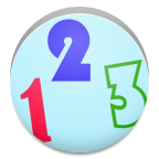
属性效果图:
")
wxml
- <view class="content">
- type:有效值:text 感觉没什么区别
- <input placeholder="type=text" type="text" value="" />
- <input placeholder="type=number" type="number" value="" />
- <input placeholder="type=idcard" type="idcard" value="" />
- <input placeholder="type=digit" type="digit" value="" />
- password:
- <input type="text" password="{{false}}" placeholder="请输入密码"/>
- <input type="text" password="{{true}}" placeholder="请输入密码"/>
- placeholder:
- <input placeholder="占位符" />
- disable:
- <input placeholder="disable={{false}}" disabled='{{false}}'/>
- <input placeholder="disable={{true}}" disabled='{{true}}'/>
- 最大长度:
- <input maxlength="10" placeholder="maxlength='10'最多长度10字符"/>
- <input maxlength="5" placeholder="maxlength='5'最多长度5字符"/>
- <input maxlength="-1" placeholder="值为-1,则不限制长度"/>
- </view>
wxss
- .content{
- border:1px black solid;
- margin: 10px;
- font-size: 10pt;
- padding: 5px;
- }
- input{
- border:1px red solid;
- margin: 5px;
- }
事件效果图:
")
wxml
-
- <view class="content">
- bindinput="当内容改变"
- <input bindinput="bindinput"/>
- bindfocus:当获取焦点
- <input bindfocus="bindfocus"/>
- bindblur:当失去焦点触发
- <input bindblur="bindblur"/>
- 内容:
- <view style="color:blue">
- {{log}}
- </view>
- </view>
js
-
- Page({
- data:{
- log:'事件触发'
- },
- bindblur:function(e){
- var value=e.detail.value;
- this.setData({
- log:"bindblur失去焦点.输入框值="+value
- })
- },
- bindinput:function(e){
- var value=e.detail.value;
- this.setData({
- log:"bindinput内容改变.输入框值="+value
- })
- },
- bindfocus:function(e){
- var value=e.detail.value;
- this.setData({
- log:"bindfocus获取焦点.输入框值="+value
- })
- }
- })
wxss
-
- .content{
- border:1px black solid;
- margin: 10px;
- font-size: 10pt;
- padding: 5px;
- }
- input{
- border:1px red solid;
- margin: 5px;
- }
组件属性:
|
属性
|
描述
|
类型
|
默认值
|
|
value
|
输入框的初始内容
|
String
|
|
|
type
|
有效值:text, number, idcard, digit
|
String
|
text
|
|
password
|
是否是密码类型
|
Boolean
|
false
|
|
placeholder
|
输入框为空时占位符
|
String
|
|
|
placeholder-style
|
指定 placeholder 的样式
|
String
|
|
|
placeholder-class
|
指定 placeholder 的样式类
|
String
|
input-placeholder
|
|
disabled
|
是否禁用
|
Boolean
|
false
|
|
maxlength
|
最大输入长度, 设置为-1 的时候不限制最大长度
|
Number
|
140
|
|
auto-focus
|
自动聚焦,拉起键盘。页面中只能有一个 input 或 textarea标签时, 设置 auto-focus 属性
|
Boolean
|
false
|
|
focus
|
获取焦点(当前开发工具暂不支持)
|
Boolean
|
false
|
|
bindinput
|
除了date/time类型外的输入框,当键盘输入时,触发input事件,处理函数可以直接 return 一个字符串,将替换输入框的内容。
|
EventHandle
|
|
|
bindfocus
|
输入框聚焦时触发event.detail = {value: value}
|
EventHandle
|
|
|
bindblur
|
输入框失去焦点时触发event.detail = {value: value}
|
EventHandle
|
|
属性解析:
wxml
-
- <!--属性:-->
- <!--value:输入框内容-->
- <input value="内容"/>
- <!--type:有效类型text,number,idcard,digit,小编感觉其他三个和text没有明显区别,不清楚是什么问题,正常number应该只允许输入数字,但结果和text一样-->
- <input type="text"/>
- <input type="number"/>
- <input type="idcard"/>
- <input type="digit"/>
- <!--password:密码格式 boolean需要{{}}表示-->
- <input password="{{true}}"/>
- <input password/> 等同于 <input password="{{false}}"/>
- <!--placeholder:占位符,对输入框内容提示-->
- <input placeholder="占位符" placeholder-class="占位符静态样式" placeholder-style="占位符动态样式,可用{{}}进行动态赋值"/>
- <!--disabled:控制标签有效,或者失效状态,在失效状态,不能获取该值-->
- <input disabled="{{true}}"/>
- <input disabled/> 等同于 <input disabled="{{false}}"/>
- <!--maxlength:内容长度限制,默认140-->
- <input maxlength="100"/>
- <input maxlength/> 等同于 <input maxlength="140"/>
- <!--focus:初始化时,获取输入焦点(目前开发工具暂不支持)-->
- <input focus="{{true}}"/>
- <input focus/> 等同于 <input focus="{{false}}"/>
- <!--auto-focus:当界面只有一个input,自动获取焦点-->
- <input auto-focus="{{true}}"/>
- <input auto-focus/> 等同于 <input auto-focus="{{false}}"/>
- <!--事件:-->
- <!--bindinput:当内容改动时触发-->
- <input bindinput="自己定义函数名">
- <!--bindfocus:当获取焦点,可用输入状态时触发-->
- <input bindfocus="自己定义函数名">
- <!--bindblur:当失去焦点触发-->
- <input bindblur="自己定义函数名">